

Australia Mortality - Trendline vs. Baseline - which approach to use?
The commonly cited Australian Excess Mortality graphs and figures are alarming but they can be deceiving...and they can hide things that people don't want you to see if you don't look closely enough..

Where we are today - the 5-year ABS Baseline
By now we are all familiar with the ABS’ Provisional Mortality Statistics and we probably all know this graph:

It’s scary. It should be scary. And it has, correctly, led people to question what has been causing these elevated levels of mortality.
I have my own graphs of this data. I use a slightly different Baseline (see here), that produces graphs such as these:

And I’ll continue to reference my graphs because I have one for each individual category in the ABS data (Overall, by State/Territory, by Age Group, by Age/Gender, by Cause of Death).
My graphs show, for example, 13.00% Excess Mortality in March against the pre-COVID 5-year population adjusted Baseline (2015-2019), whereas the ABS claim 11.3% against their non-popn. adj. 4-year (skip a year) Baseline (2017-19 + 2021).
But here’s why this Baseline-referenced graph can be misleading…
5-year Trends
Sometimes, we get better at treating particular illnesses, and so the year-on-year figures will actually decrease, even if our population is increasing.
But, considering every one of us will unfortunately have to die at some point, that means that another illness will see an increase to counter our progress in combating the first cause of death.
Let’s look at some non-real examples to see what I mean.

In this made up example we see the blue Actuals trending up over time. The orange line is the averaged 5-year Baseline. So:
The red dotted line is what we would actually expect to occur in Year 6 but, based on the orange Baseline, it would look to show 3 units of Excess (that aren’t real). Excess is really 0;
The green dotted line looks worse. Looks like5 units of Excess when there’s really only 2 units of Excess;
The purple line is the worst. Looks like 1 unit of Excess when, in reality, there is negative 2 units. Deaths from this made up illness actually fell against what we would expect (red).
Now, before you start yelling at me “You’re just trying to hide Excess Mortality!”, bear with me.
You see, it works the other way, too…

If, in theory, there was illness that we were getting better at treating then those numbers would be coming down year-on-year, even with an increasing population. But, against a 5-year averaged Baseline, they might look like negative Excess:
Red dotted line is what we would expect, but against a 5-year Baseline would look artificially low, as if it had gotten better when it had not;
Green would look like negative excess against the orange Baseline. It is an improvement (2 units below red line expected) but a massively overstated one (5 units against orange Baseline);
Purple, on the other hand…looks below Baseline (so, negative Excess = improvement) when in reality it has gone up against expectations (red expected). Presented as negative Excess when in fact it is hiding positive Excess.
What might we find if we looked at Trendlines rather than Baselines? Here’s a hint:

ABS data against the ABS 5-year averaged Baseline seems to show that Ischemic Heart Disease has been in negative Excess Mortality (read: better than expected), since 2021…
Patience, friends…
So, let’s look at Trendlines
What if, instead of an averaged 5-year Baseline, we look at a Trendline of the actuals of those same 5-years? Maybe, because the ABS has only released the first 3 months of data for 2023, we ran a trend graph of those 3 months against the preceding 8 years of data (5-year comparables pre-COVID - 2015-2019 - plus the 3 COVID years of 2020-2022)?
We would get this:

We can see the following:
The 5-years used to establish Trend (2015-2019 with no COVID impact) are very stable (hold closely to the red Trendline), so we know we can project them out into the future as the Trendline is real and reliable;
Not much Excess Mortality in 2020 or 2021 (but…muh COVID PANDEMIC!!!);
Something…happened in the first 3 months of 2022;
That “something” has left a lingering affect into the first 3 months of 2023…
Once again, this is real - this is not an averaged Baseline but a tightly held Trendline.
So, let’s jump right into specific Causes of Death to see what we can find:
Respiratory Illnesses

Result: negative Excess Mortality in first 3 months of 2021-2023.
My take? Respiratory illnesses are deaths of the vulnerable, by and large. Here, they’re already gone - killed early by other causes. We can see from 2021 that this is not COVID because Australia didn’t have any COVID in the first 3 months of 2021 (Yay totalitarian lockdowns!)
Cancer

2019 natural bump (it happens) artificially lifts the red trendline upwards, so refer to the adjusted green trendline that holds against 2015-2018 and 2020/2021.
Result: we see the Q1, 2022 Spike. This will become familiar.

Dementia has the Q1, 2022 spike

Diabetes has the Q1, 2022 spike.

“Other” non-COVID Deaths certified by a Doctor (so, not Ischemic Heart, Cerebrovascular, Respiratory, Cancer, Dementia, Diabetes or COVID) has the Q1, 2022 spike and stays elevated in 2023.

non-Doctor certified deaths (most likely Coroners) - 2015 random high (it happens) artificially lifts the left of the red trend and thus tips the right of the red trend down. Ignore and use the adjusted green trend that holds truer to 2016-2021.
Again, we see a small Q1, 2022 spike.
Seeing a trend here? A spiky trend, perhaps?
Now, for the interesting ones…
Ischemic Heart Disease
ABS vs. averaged Baseline shows negative Excess Mortality.
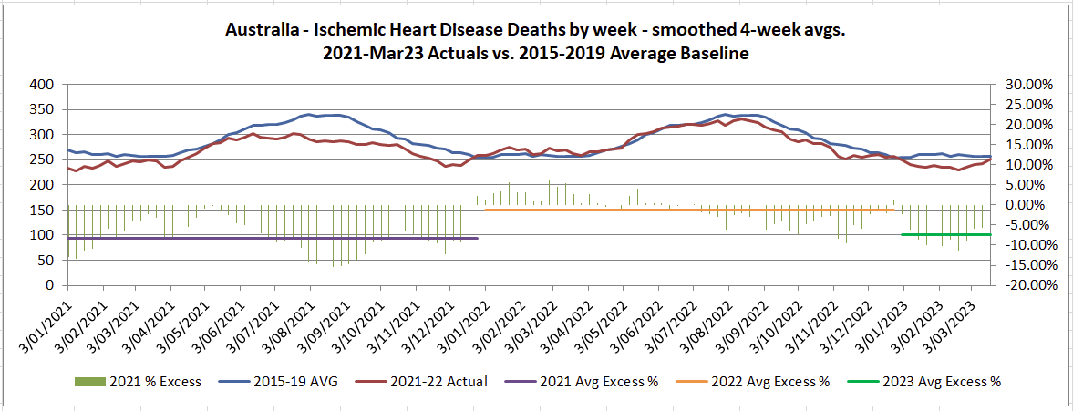
Did you ever wonder why there was no Excess Mortality in cardiac deaths in Australia according the ABS data? It’s because they used a 5-year averaged Baseline against a naturally descending trend.
Reality?
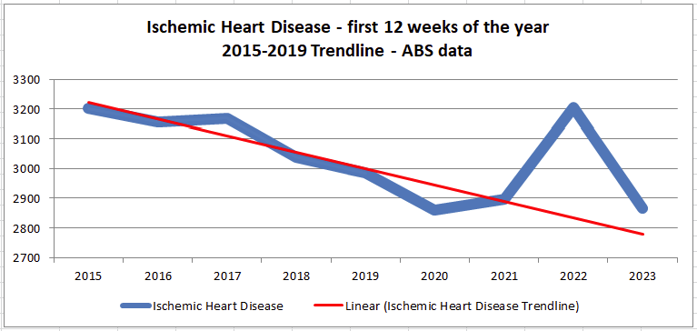
Look. At. That. Spike.
It’s yuuuuuge. And you never would have guessed it looking at the ABS graphs.
And something is lingering in 2023…
Cerebrovascular deaths (Strokes and Aneurysms)

ABS 5-year averaged Baseline comparison shows negative Excess Mortality. Makes it look like strokes and aneurysms were below expectations.
Reality?
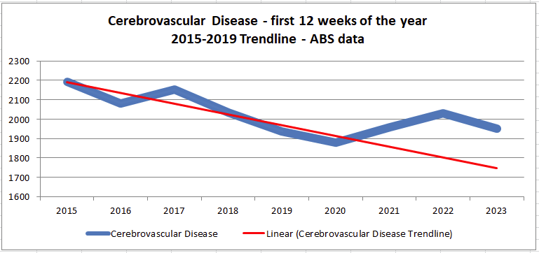
There’s our old friend the Q1, 2022 spike again. And an elevated Q1, 2023.
Can you see now how we can be deceived?
Apart from Respiratory Illnesses, everything has a Q1, 2022 spike. Everything. Even though Ischemic Heart Disease and Cerebrovascular Disease look negative in the ABS graphs against a 5-year averaged Baseline.
Q1, 2022. What happened?
We all know. So let’s just dump a graph real quick.
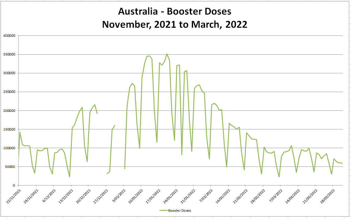
Makes you think, doesn’t it?
One more quick one before we finish up. And this is the worst one of all.
Females 0-44

ABS data vs. 5-year averaged Baseline seems to show the Actuals being slightly low against, or at worst even with, with the Baseline. Nothing to see here, right?
(Although that April spike is going to be interesting when the next ABS data set comes out in 2 months).
But against a 5-year Trendline?

There it is - the Q1, 2022 Booster spike and…it’s slightly worse in 2023.
The impact of this hit hardest against our young women - those who we should be protecting the most.
Summary
The ABS 5-year Baseline should have a close eye kept on it. It’s important and the first sign that something is wrong.
But we should dig deeper. Always. Because the deeper you dig the more truth you find.
In this instance - cardiac deaths and strokes/aneurysms do have a temporal relation to Australia’s Booster doses.
Hold the Line. Keep digging. The truth will prevail.
Good work. I think much of ths sort of obfuscation is "de rigeur" as governments instruct statisticians to conceal evidence of criminality and wilful negligence.
It’s been difficult to tell people that our governments aren’t satisfied with simply stealing as much as they can from us but actually are killing us. People just resist the message. This kind of work brings clarity to the conversation. Thank you for posting this!