

Australian Excess Mortality Graphs to August, 2023
All ABS subcategories of deaths. Using a Weekly Tracker, with Baselines adjusted for 2015-2019 Trends

This Stack serves simply as a collection of all mortality subcategories that the Australian Bureau of Statistics uses in its monthly Provisional Mortality Statistics releases.
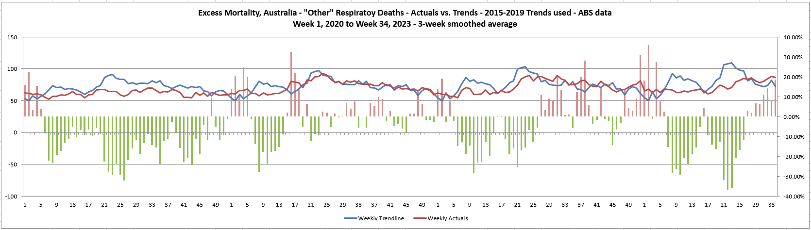
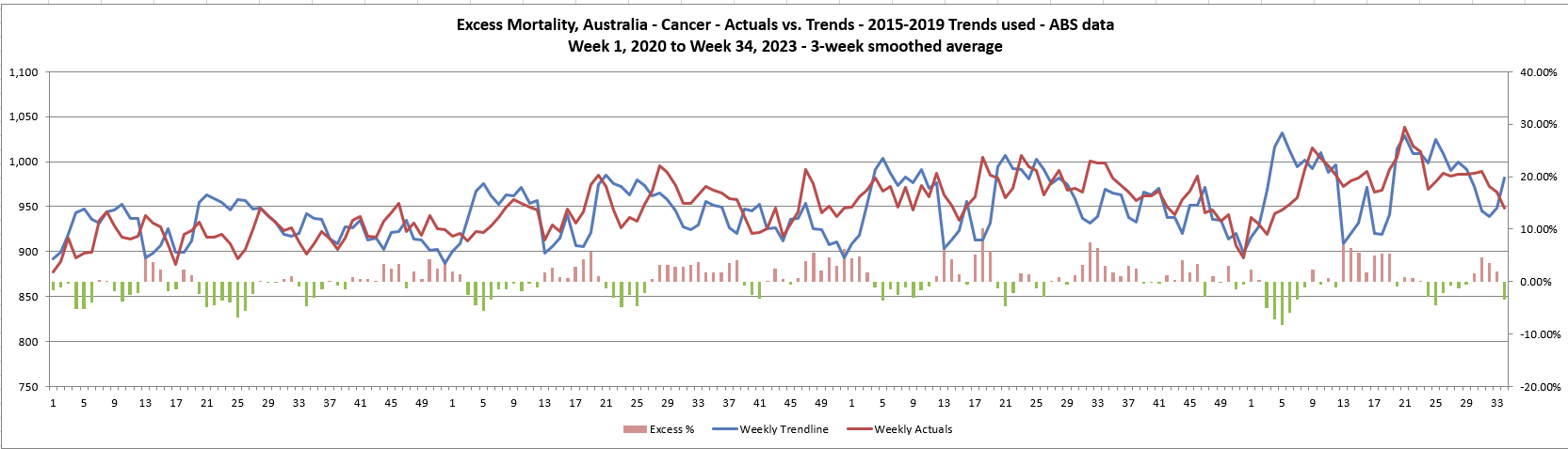
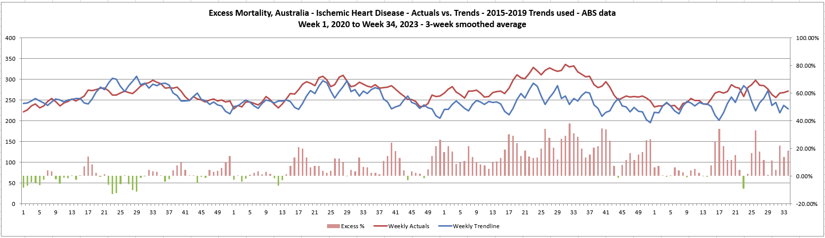
NOTE: I do not use the standard ABS 5-year averaged Baseline. Instead, I take the 2015-2019 Trend for each individual week, run a 3-week smoothing (week before and week after included) and use that as my Baseline.
For an explanation as to why this is my preferred method, please see here.
For reference, I will start with a graph showing COVID cases and COVID vaccinations in Australia by week (1000s for each set) so you can make your own decisions as to whether COVID itself or the Vaccines might line up temporally.

And now I’ll simply post the graphs for people to view and, if you choose, reference.
Overall Excess Mortality

By Age Bracket


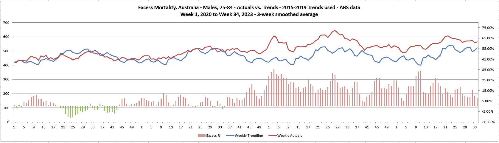
Males by Age Bracket


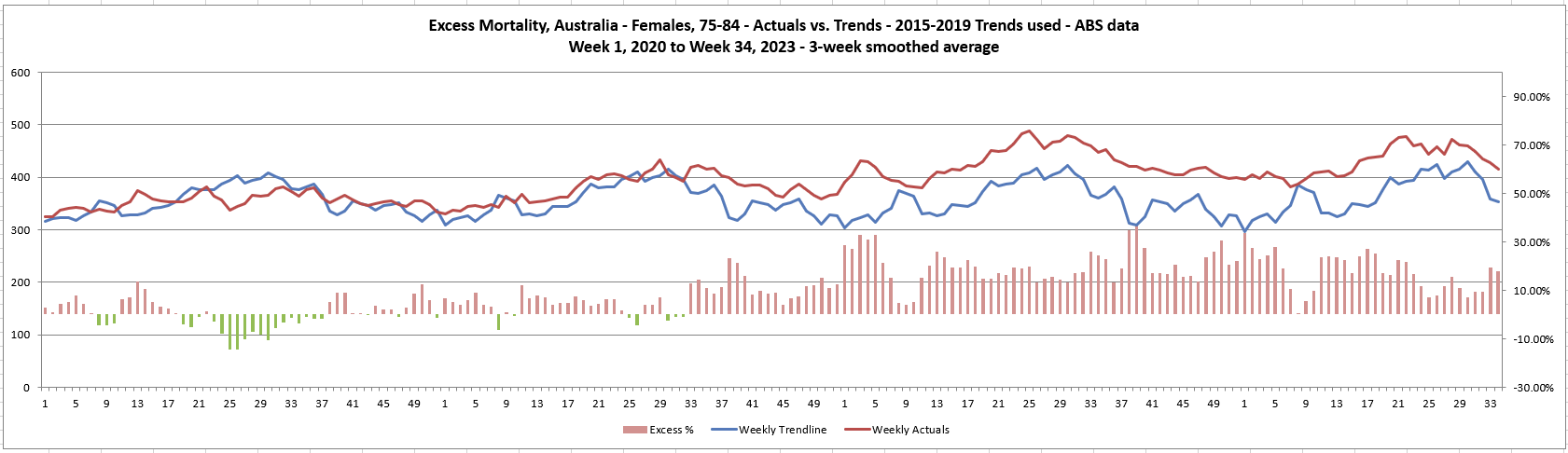
Females by Age Bracket


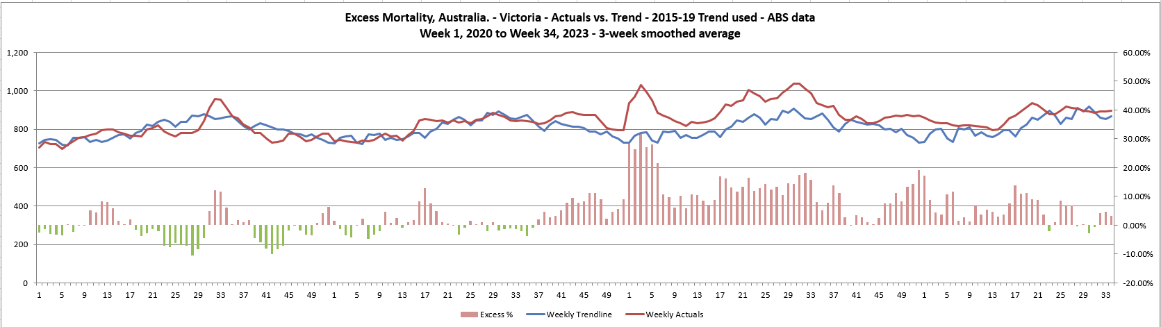
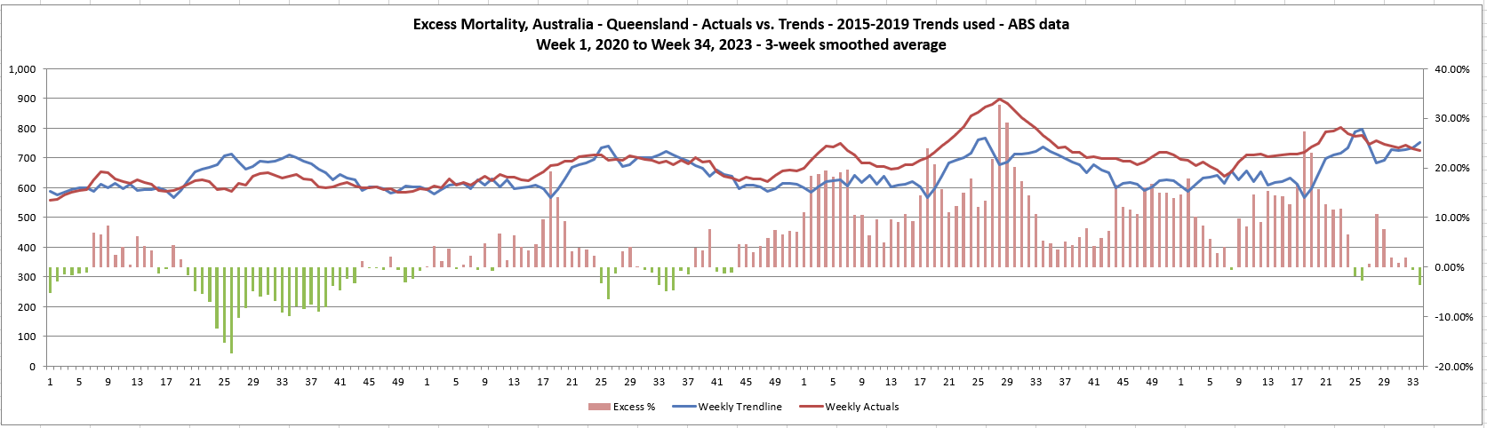
By State and Territory


By Cause of Death


And, now, you can make your own decisions on what you see being behind the above…
I'm doing the same analysis here in NZ. Your method similar to that used by the HMD, known as the Shrt Term Mortality Fluctuation. They have a shinyapp that does the graphics. The 5-year trend of weekly deaths suffers from 3-major flaws. I used it myself for a court case against the NZ MOH, where I also pointed the flaws. I now used death rate data, also available on the STMF app, as it takes out population anomalies. The NZ government provides death rates for age bands from 1991 onward. The biggest casualty in 2022-3 was the over 90 cohort, although I have noticed the 60-69 cohort is doing badly in 2023. A lot of the deaths are occurring the warmer months, which is unusual. The older cohorts did better in the winter if 2023, because the vulnerable had died off in 2022.
Thank you that’s a massive amount of work 🙏